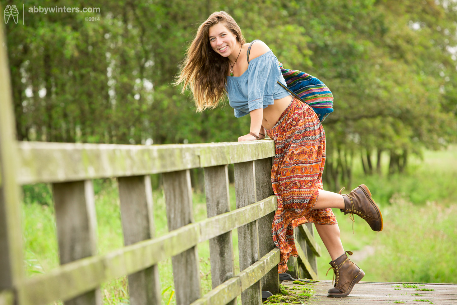
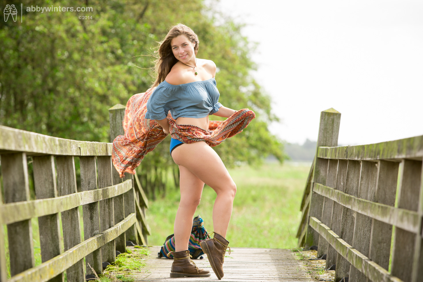
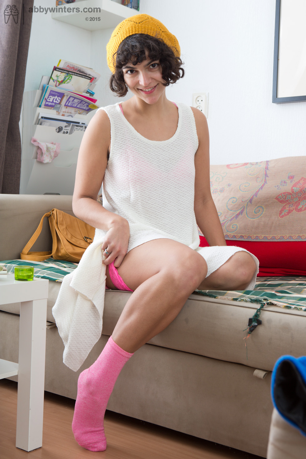
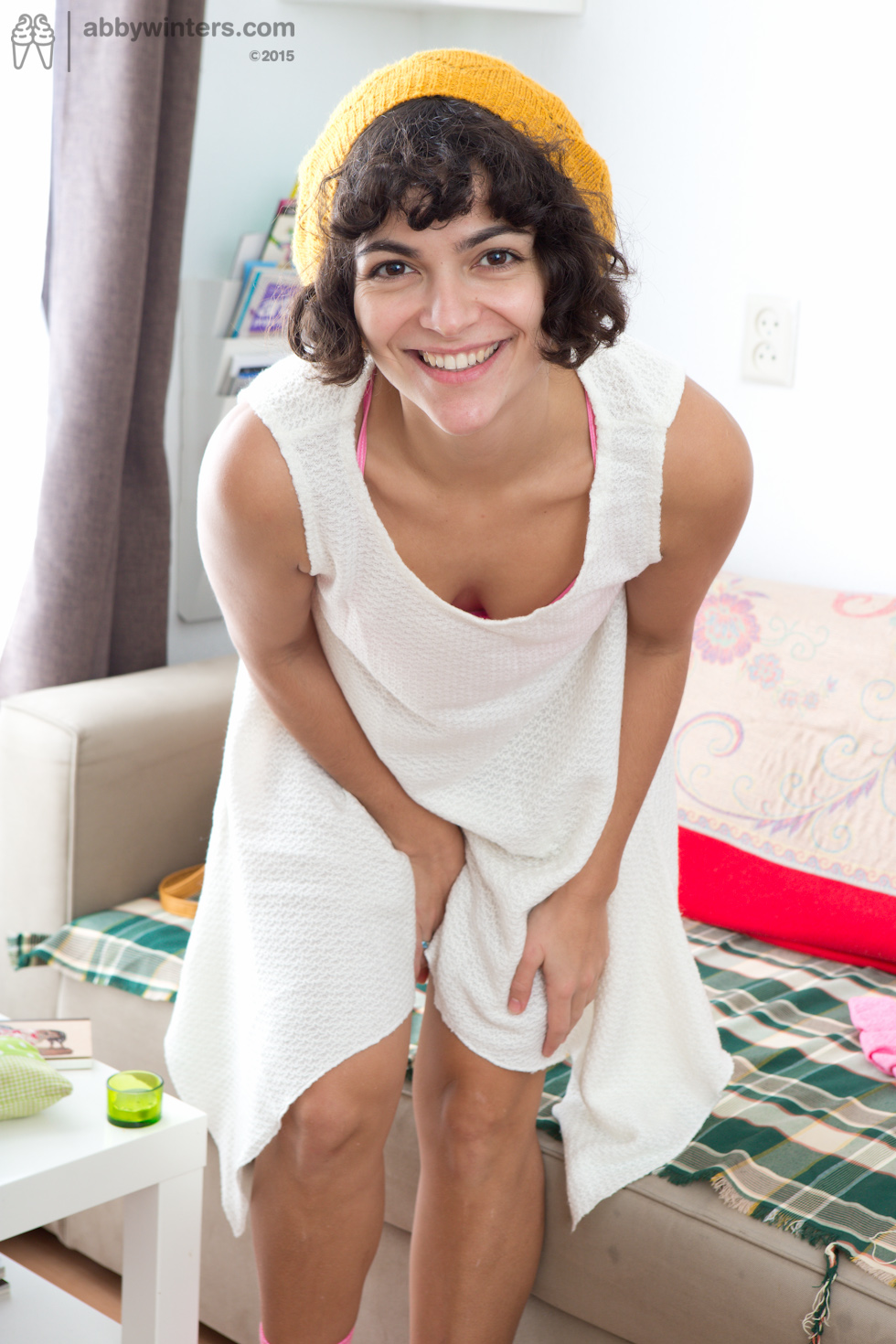
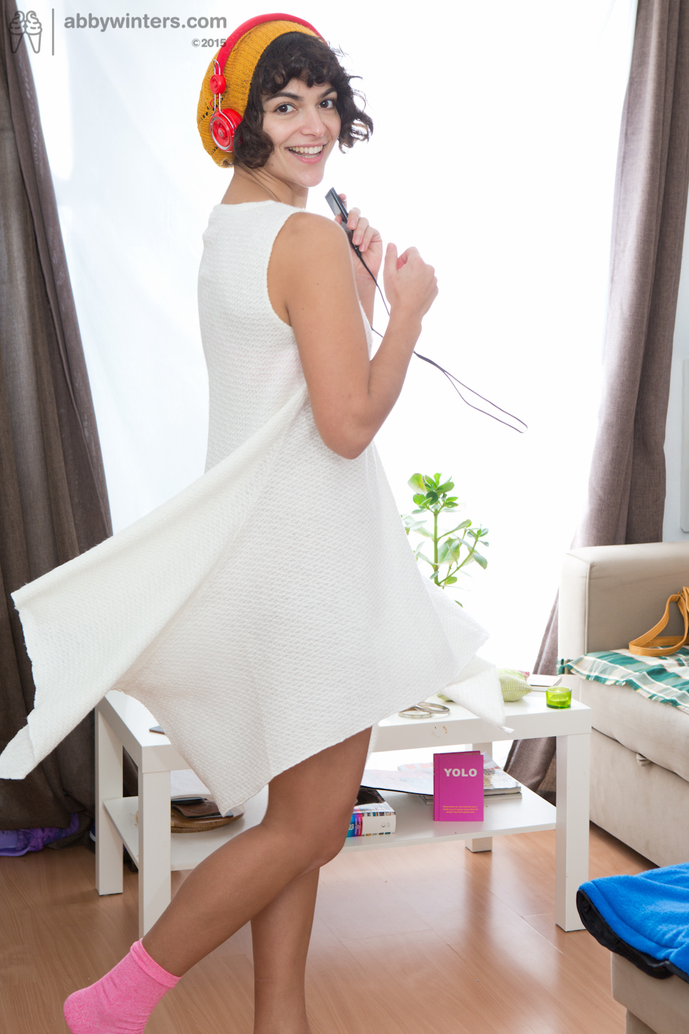
Utilising extensive natural light always preferred for abbywinters.com shoots. However, in winter months, natural light may not be available in suitable quantities fully illuminate the model and Setting across a full shoot day. In most shoot situations, a mixture of natural light mixed artificial light is required.
When that’s not possible, we aim to use high-key lighting and emulate natural light from large windows.
Natural light is particularly good for adding highlights to a model but care must be taken to avoid contact with direct sunlight in most circumstances – such high contrast between light levels can not be exposed for correctly, and results in missing details – and ultimately frustrated customers!
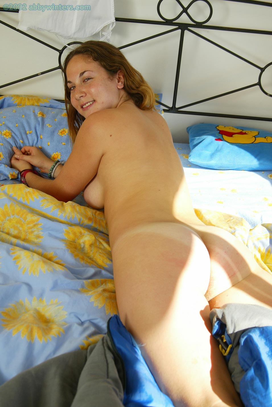
There are two approaches to mixing natural light with artificial light:
- Using an artificial source to boost the natural light
- Using an artificial source in parallel with the natural light, with the artificial light filling in the areas that the natural light cannot
Using artificial light to boost natural light
On paper very simple:
- Step 1 Find the natural light
- Step 2 Place an artificial light so it’s beam follows the same direction as the natural light – boosting what is already there.
The potential issue is diffusion. The supporting artificial light needs to be modified to prevent it from being a direct and specular source (as that will lead to hard dark shadows and will not look natural, will not be flattering, and is off-paradigm).
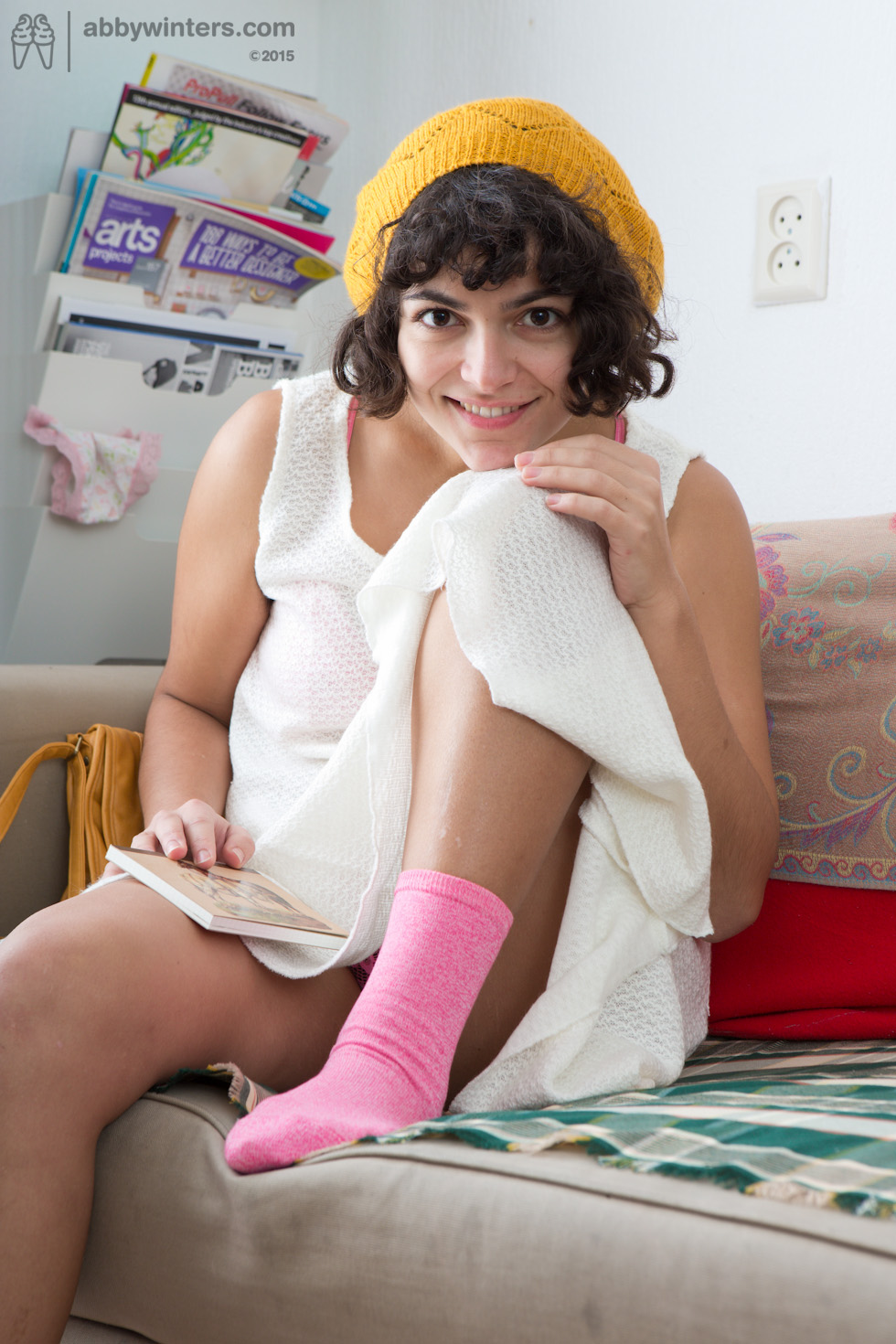
Using artificial light to fill in the gaps
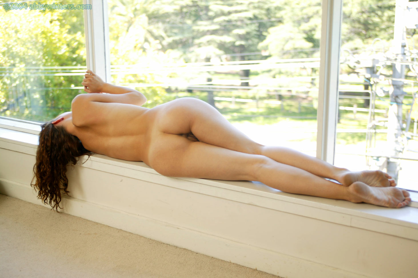
Ana’s Solo shoot (made in 2004) came at a pivotal point in the abbywinters.com journey. It was produced by the Creative Director, long before any assessment areas have been devised, really before what abbywinters.com is all about had been fully defined. At the time, Garion was pushing himself with lighting and trying to master mixing two sources – flash and natural light. This shoot was an instrumental turning point, the first time he mixed sources to (we think) excellent effect. It was around this time that the value of producing light that appeared natural (regardless of the reality) became apparent within the abbywinters.com brand.
Don’t show the source
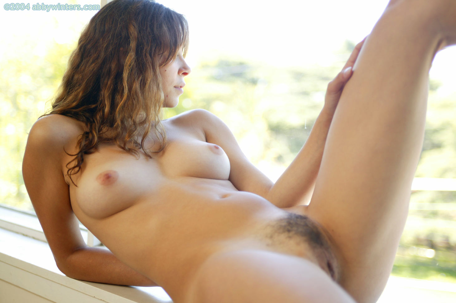
While overall the lighting in Ana Solo is excellent, some of the framing is problematic, with washed out backgrounds detracting from strong lighting on the model. An epiphany saved for another day, Garion soon came to the conclusion that similar to how it is detrimental to show the light stands and flashes in a shoot, so to is it bad to show the natural light source.
Kenji’s excellent outdoor Solo shoot (captured by SP Misha) holds lots of great examples of how natural light can be used to strong effect, being most successful when the light source is omitted from the frame.
If the sky was able to be exposed correctly (either blue, or textured clouds), including the sky is encouraged. When the sky has to be over-exposed (“blown out”), always frame it out.
Related topics
While the simple rule is to ‘not include the light source in frame’, there is value in showing bright skies and interesting views outside of the window during shoots, it is just not easy to do. FAQ – How can I expose images to include the view from the window? – documents how to approach this.

