The following images are all considered excellent examples of the abbywinters.com creative and technical requirements. SPs are encouraged to recreate and be inspired by the following examples:
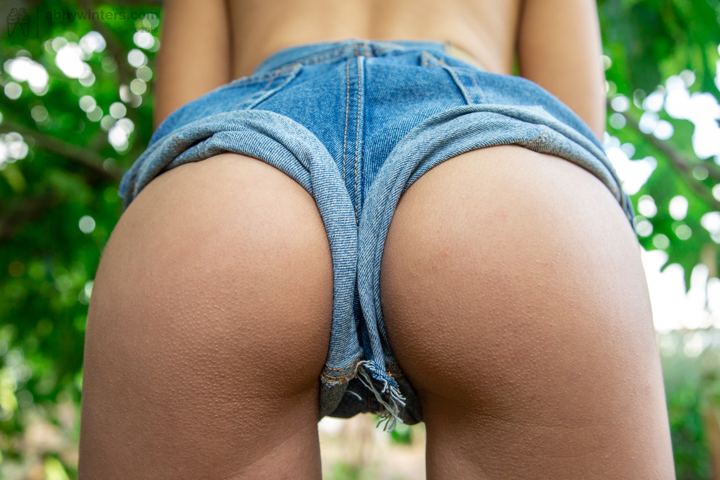
Anais V – Buttocks in jean shorts

SP Ursula didn’t accidentally capture the model from behind in jean shorts and end up with a stunning result, everything in this image has been engineered for maximum impact.
When SP’s are aware of a model’s most appealing attributes, they are better placed to showcase them. Anais V has great buttocks. Knowing this, the SP ensured that a standard image of a model’s buttocks in clothing from behind was shot in a way to celebrate this most appealing aspect.
Excellent model pose
Anais V has been directed onto her tip-toes while pushing her buttocks out and back. This ensures maximum curvature of the buttocks, emphasising their shape. When a model does not push back and out, buttocks can appear flat, which is less appealing and sometimes unflattering.
Buttocks are often compared to fruit, for example ‘a peachy bum’. In this image, the model’s buttocks do resemble ripe, round fruit, something customers might want to bite into! This gives the image a visceral quality.
Perfect camera position
The position of the camera, with the SP being square-on to the model but also a little lower, ensures the whole of the buttocks are visible and that the shape of the curves are emphasised.
Good clothing use
Jean shorts worn “correctly” are appealing but knowing that this image was an opportunity to explore and celebrate the shape of this model’s buttocks, the SP directed the model to roll the legs of the shorts up and out – exposing as much flesh as possible. The result is a denim frame for the model’s round buttocks, that really emphasise their shape.
These shorts were not designed to be worn this way, the model has intentionally pulled them up to show off her buttocks (the very definition of the “Clothing use” assessment area!).
Proficient tech
Lighting and exposure have been managed well, and this ensures customers can see the tiny details, such as the goosebumps on her skin. Showing texture and form is vital when emphasising shapes of a model’s body.
The outdoor setting is very on-paradigm, but the image would be less successful if the depth of field showed the background in equal detail to the foreground. The bright greens of the leaves are enough to confirm the model is outdoors in nature and the shallow depth of field helps to separate the buttocks from the blurred background.
The use of the natural light is excellent, the light adding in delicate highlights on the right thigh of the model. There are differences in light levels from left to right which adds interest and creates shape but the difference is not so much to be too contrasty.
Improvements?
This is an excellent image in many ways, but everything can be improved upon!
- A reflector to add more light between the model’s legs would reveal details of the camel toe starting to form
- A hint of panty colour under the jean shorts would be excellent tease
- If the model had been directed to place her legs and knees together the shape of her buttocks would appear even rounder
- Position the model so there was a full coverage of leaves in the background – no over-exposed sky.
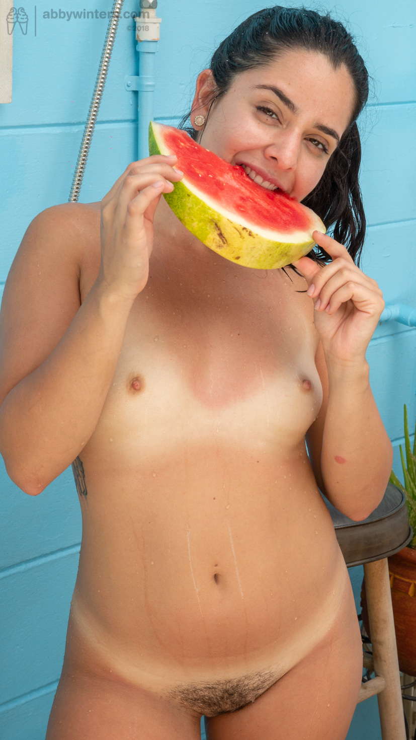
Claudia V – Tan lines in the garden

SP George brilliantly captured the essence of summer within this one image. Long summer days and warm summer nights are things most people associate with pleasant memories, time off from work, life before responsibility, summer romances etc. Capturing all those feelings in a single image transports customers.
Compelling composition
The juxtaposing colours of the blue wall with the red of the watermelon work really well in combination and both colours are bright and vivid – in line with the abbywinters.com colour pallet.
Prior to this image, the model was washing her body using an outdoor shower. The lines of water down her stomach not only invite customers eyes toward her pubic area, but the arc of the lines emphasise the roundness of her tummy.
The innocent act of the model eating watermelon brings oral focus into the image and all the sexual connotations that go along with that.
Despite being nude the casual pose, cheeky smile and bright eyes of the model create an overall wholesome image, beautifully on-paradigm.
Fetish
Tan lines are a popular fetish, they suggest a sense of wholesome innocence (as the model has not been sunbathing naked) and they add in a feeling of summer.
The model’s pose, while seemingly random at first glace, ensures that her arms do not obscure the tan lines across her breasts and her hips are twisted so that her lower tan lines are pointing directly into the camera.
Tech
This image was shot using natural light. The SP selected a setting by the blue wall because it was in full shade, an even flattering light with no hard shadows. Sunlight is bouncing off a large surface off-camera, highlighting the wet lines running down the model’s stomach, emphasising the texture and form of her tummy and other feminine curves. The SP is standing appropriately off axis from the source.
Improvements?
While this is a great image, it could be even better:
- The model’s tattoo is needlessly visible, a small twist of the model’s body and it would not be there
- While the model’s smile is nice, this would be a more naturalistic image if the model was really bighting the melon rather than posing with it. The inclusion of those juices running from her mouth, an apologetic or amused smile from the model as the juices spilled over her, would be more visceral and add in more personality.
- Framing – The model’s right arm is needlessly cut off on the side.
